What does inclusive design mean to you?
Inclusive design means the design is clear and accessible to all. Including text to speech, making the design clear and precise and adding in specific features in order for anyone to be able to access the design is what I visualize when I hear inclusive design.
Have you used Text to Speech tools before? Did you find it useful? Did you try out some of the different voices? What impact did the different voices have on your ability to absorb information?
I have never used Text to Speech in an assignment or creation that I have made but I do tend to use it when it’s an option. I find it useful when I am trying to read a presentation a professor has created or my job has made. Listening to the speech tends to help me understand what is trying to be explained rather than reading it. I have never tried different voices other than a standard robot type voice. However I am sure that hearing text from a voice that is less robot and more human would help me absorb the information even more.
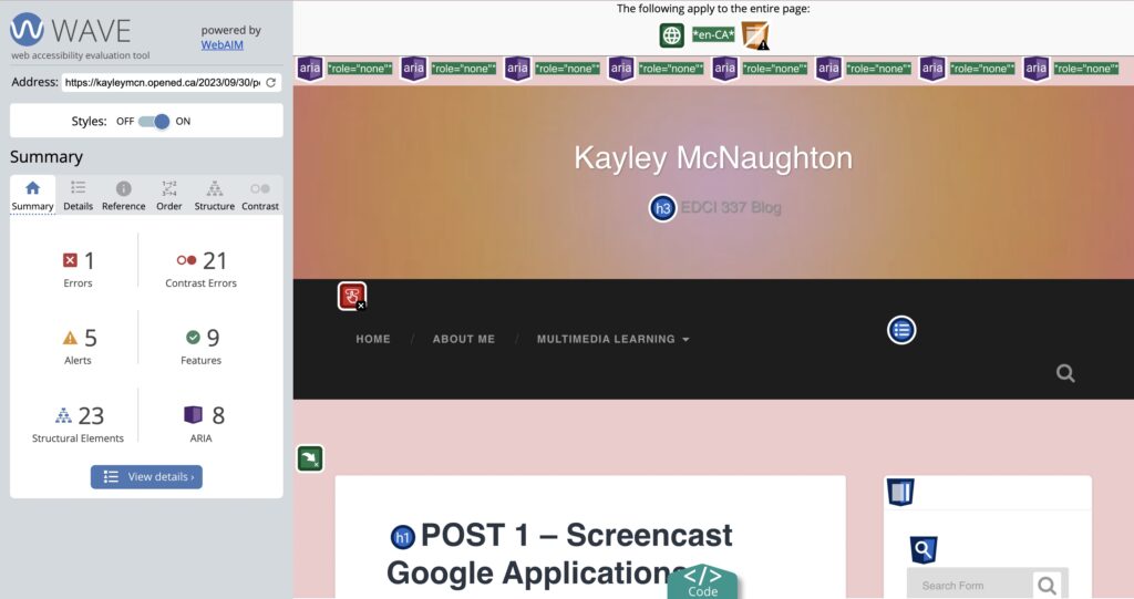
What did you find when you ran the WAVE accessibility report on your blog post(s)? What did you expect and what was surprising? Is there anything you will do differently going forward?
I had no idea what to expect when I ran the WAVE report on my blog. I have never used this type of application so I played around with a bit after I ran through my URL. I noticed WAVED flagged the bullet points which lead to my reflection answers. I was surprised by this because I would have assumed the bullet points made it more clear as to what it an answer and what is a question. Going forward I will focus on colour contrast in order to make the blog post brighter with more contrast added!
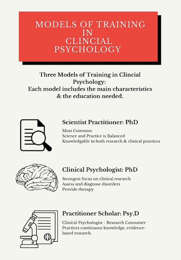
Which design principles did you use to create your infographic in Canva? Which elements of a ‘good infographic’ were you able to incorporate? What other principles did you consider? What does the template make easier and what does it make harder when creating your infographic?
Creating my infographic involved multiple design principles. Focusing on alignment, leverage contrast and leaving negative space are three primary principles I focused on. I made a infographic on three training models in clinical psychology. Each model includes a short bullet point description of what the training entails and the academic level that is attached to it.
Focusing on alignment: All information is in the centre of the page in order to make it clear and precise instead of the important information placed in a confusing order throughout the page. In order to do this I used a template that helped me accurately align my information for the best outcome possible. The alignment of information not only helps the viewer understand clearly it is visually pleasing.
Leverage Contrast: I wanted my graphics to be in black and white for that simple reading contrast that is not too overpowering. However by adding in a bright red brings colour forward and contrasts well with a black and white background. The red helps bring the viewers eyes to the first part they should pay attention to and leads down to the main information.
Leaving Negative Space: I focused on simplicity. I wanted to add graphics in a way but without it taking over the information. I used the small graphics as a bullet point to show where the information begins. I think I could have left more negative space however I do believe the amount of negative space that was left is enough to make the information clear and contrast against the colours and graphics added.
Graphic design is inherently visual – what additions or modifications could you make to ensure that learners with visual impairments have access to the same information in an infographic in an online setting?
Additions I could add is a speech to text option as well as a more colour to brighten the information. If possible a manual way to zoom in and out from the text may also be helpful!
2023-10-14 at 11:00 am
Great post, Kayley! I totally agree when you said that you use text to speech when it’s an option! I also find myself having an easier time learning when it is said to me compared to reading. I also find it highly beneficial to read along as it is read to me!
It’s interesting that you were also surprised about the WAVE report alerting you about headings/bulletin points like I was! This definitely caught me by surprise.
I really enjoyed reading your post and learned a lot from reading your viewpoints on this modules topics. I also enjoyed your infographic and how clear-cut it was. It was very easily to follow along and not too distracting or flashy, great use of negative space!